

As the digital world continues to develop, there are growing web design trends that are set to be big in 2022.
The past two years have given us all plenty of time to surf the web. The internet is at our fingertips and it’s never been more populated than it is right now.
The shift to a virtual world was influenced for many by the COVID-19 pandemic and resulting lockdowns, when being online was the only way to stay connected and stay in business.
This rapid growth in popularity and way of life means web designers need to constantly be upping their game. Websites today need to be more than just a few pages to browse. They have to put the user first, offering an experience that is unbeatable.
As we look to the future of web design and particularly what we can expect in 2022, the KIJO design team have collected these key trends from the corners of the web, that are set to become mainstays of websites this year.
“With the digital world becoming more populated and swamped with competition, 2022 is transitioning away from clean, minimal designs to more disruptive, engaging experiences in order to stand out from the crowd.”
Liam Terry, Head of Design @ KIJO
Understanding that each user is different and will explore a website in different ways at different paces is key to the success of any design.
Storytelling is set to be big this year. With people becoming heavily invested in a brand’s story more than ever before, exploring a website has become something akin to a fact-finding mission.
Whatever message you want to convey, you need to be using your website’s design to do it. The idea of storytelling within your website includes creating a sequence of visual elements that are organised chronologically to convey a specific message to visitors, both consciously and subconsciously.
Users should be able to explore these elements in their own way, without feeling rushed or pushed into a specific direction or action.
Storytelling should convey your message to your audience in a striking manner, serving up all the information they need in order to captivate and educate them.
When a user visits a website they will instinctively expect to scroll vertically through the website, moving down through each content section as they explore the site.
Horizontal scrolling therefore provides users with an element of surprise from the minute they land on your homepage.
By implementing horizontal scrolling you’re providing users with an interactive experience to keep them engaged as they journey through your website.
A side-scroll layout can allow opportunity for more interesting dynamics between text and images and can result in more fluid movements, encouraging the user to keep scrolling through content elements.
Horizontal scrolling works particularly well for websites that want to combine multiple medias of content such as imagery, text, video and sound. Portfolio websites or catalogues of products lend themselves to horizontal scrolling thanks to the nature of the content.
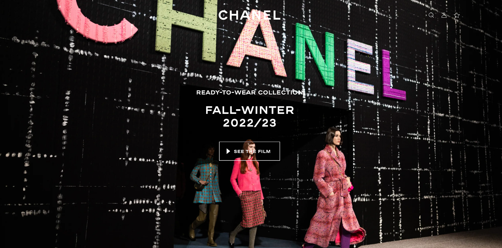
Brutalist typography is bold, dominant typography that conveys the message of your website in the most striking of ways.
Often, the bigger and bolder the typography on a page, the longer an impression it makes. Depending on just how big and bold you go, your words can eventually become a graphic element in their own right.
Making your copy the visual focal point of your website allows you to make your website stand out with a limited amount of elements.
Whilst many trend-led websites today choose to take on a more minimalist approach, brutalist typography directly contrasts this, helping your website to stick in the mind of visitors.
Large, striking typography can be used to present your message to users through navigational elements, section headers and as building blocks for paragraphs and sub-sections.
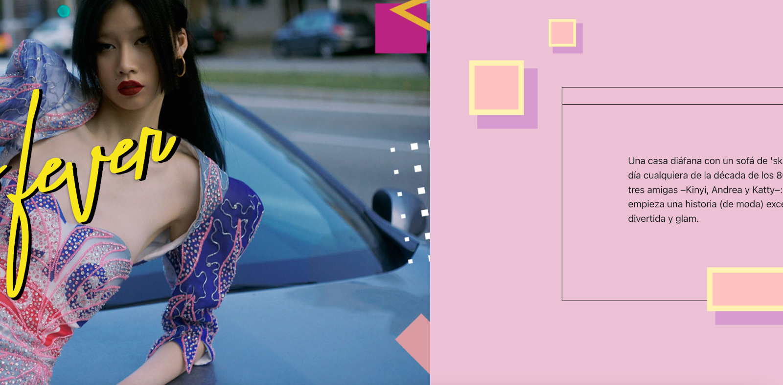
Most web designers and UX/UI specialists will work with some sort of grid when creating their designs. A grid provides shape and structure to a website. Going “off-grid” therefore provides the opposite.
Off the grid designs aren’t a new idea but we can expect to see considerably more of them in 2022.
An off the grid design helps to make a design really stand out, conveying messages or specific page elements in an eye-catching and exciting way.
The goal of an off the grid design is to draw the eye of the user to a specific element which is why designers will often incorporate this design feature through text or stickers.
By breaking out of the traditional grid approach, designers are able to add more personality to the website not through the content but by the layout of the website. Think Jazz of the website design world.
Remember when a colour scheme meant adding the brightest, contrasting colours together and hoping for the best? If so then you’re probably a child from the 80’s or 90’s, a time when contrasting colours were everywhere.
In recent years specific colour palettes of complimenting colours have been the mainstay of branding and website designs. Not any more.
Colour is one of the most obvious ways to grab users attention, helping to catch the eye and stimulate specific reactions and emotions.
With digital industries and the inception and rise of NFT’s leading the way, this year we can expect to see websites become more and more vibrant, filled with popping neon colours, contrasts and bright gradients.
Web design trends of recent years have placed a heavy focus on clean, minimal designs that feature simple imagery and text.
Now however we are starting to see a shift to more complicated, complex designs that contrast to the simplicity that users have become accustomed to.
Multilayer designs that feature different layers of content, usually images and text, challenge this convention and encourage users to explore more of a website, creating a more immersive story-telling experience.
A key benefit of this trend is not just the interactivity it provides for users. It’s also a great way for websites with a large amount of content to display this all in one place without overwhelming the user experience of the website.
As we journey through 2022, websites find themselves on the brink of a new era, the metaverse, where implementing features such as AI and augmented reality will become essential for website designers.
Whilst we wait for the inevitable, as these trends have proven, web design will continue to evoke emotion and grab attention. Whilst the content of a website may tell a story, it’s the design that truly speaks to a user.
Whilst trends can be a great way of guiding our work, the KIJO design team always put the website’s aims and purpose first. As we enter an exciting new era of the digital age, this ability to juggle trends with lasting design will be essential for the creation of successful websites. So if you’re looking for some help navigating your way around the world of web design simply contact us today. – We’re more than happy to help.


